
This is a honey label review, and in this article I appraise the ‘Galloway Honey Farm Scottish Heather Honey label.’
As an aside, the taste of Scottish heather honey is wonderous, although it might be a bit too strong for some palettes.
Finding local honey in Scotland proved challenging during my visit there in August. After spending the week looking for Scottish honey I drew a blank but finally finding a jar in a motorway gift shop on the Scottish Borders.
Read more: Honey Label Review – Galloway Honey FarmSadly, the labelling on this jar is lacking, so let begin my honey label review.
Honey Label Review
I imagine selling Scottish local honey in a Scottish themed gift shop, which sited in a motorway gift shop on the Scottish Borders, must be easy. No effort required. Resultantly, this lack of competition or the need to step up, shows in the label.
Here’s what I learnt from this honey label.
Readability
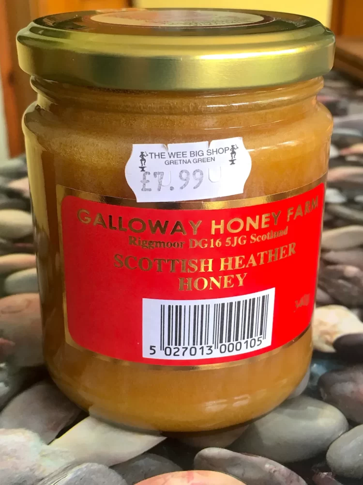
On the face of it, what could go wrong if you have a glossy label, with a red background, and a shiny gold lettering? I found the honey label difficult to read, particularly the smaller gold-print.
What’s it for? Whose it for?
Where’s the story behind the honey?
Who made it, what does it taste like, who would like it? Where are the hives located and what about the local environment? Does the label itself suggest a story. Is there a website? There is nothing on the label to tell a story.
Where to place the boring information on the honey label?
Some information is really boring and barcodes are particularly so. But where should you put it?
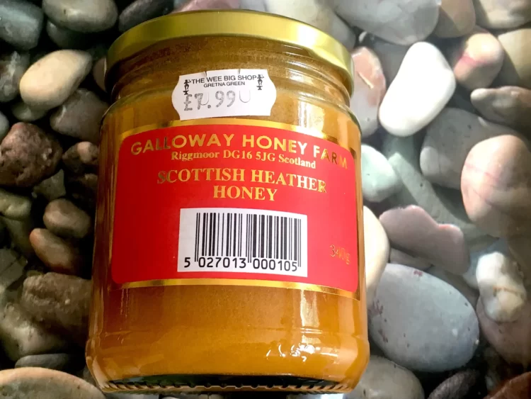
Bizarrely, they chose the most prominent part of the label? This is extra weird when you consider that most honey jar labels display an iconic picture, such as a hive, a bee, a flower, or honeycomb etc. Instead, the barcode is the icon.
Placing the barcode at the edges of the label would have been a better option, with it orientated on its side. I suspect the problems arising with this label are caused by its small size. Consequently, there is no room for beauty, just function.
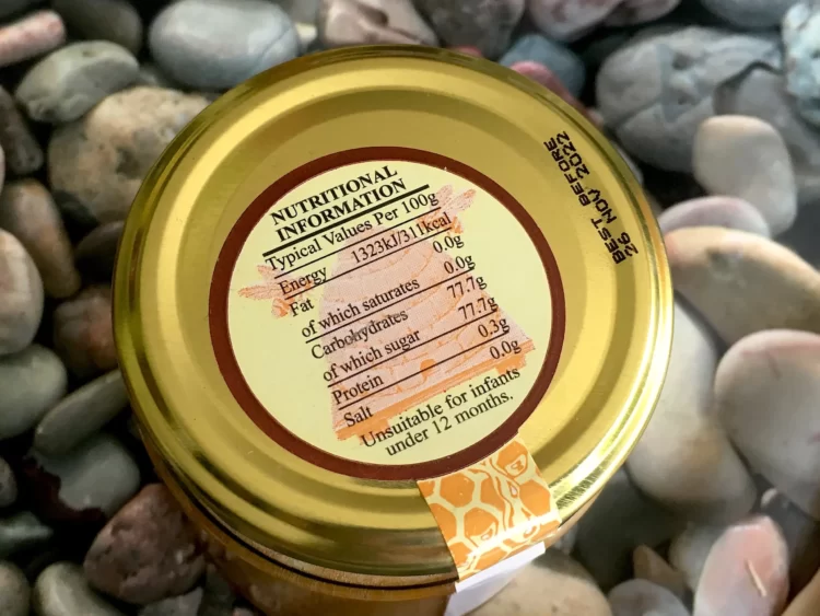
Even More Boring Information!
If your product contains a single ingredient, then nutritional information is not required. Yet, they love giving us guff.
Galloway’s problem is too much boring information and not enough label. But they found another place for another boring label. Can you guess where?
Honey Label Review – Conclusion
Why make a label joyless and functional? Their honey is amazing but the same can’t be said for its presentation. A good design incorporates beauty.
The biggest lesson from this label is don’t just tell us the facts, design the label to tell a story.
Post Script
This post is part of a bigger project, so please consider reading my posts about London Honey Company and Saddleback Farmshop. These look at the topic of honey jar label design.